
Design in Focus
The Scope of Work Included :
Series Concept & Co-Founding — Editorial Direction — Series Brand Identity — Art Direction — Interview Production & Curation
Design in Focus is an ongoing editorial series co-founded by STNMTL and Branding in Asia, one of the region's leading voices on branding, design, and creative culture. Each edition turns its lens on a single nation and asks how design operates there — not as ornament, but as infrastructure: woven into industrial policy, export strategy, and cultural identity. Design coverage celebrates studios, campaigns, and awards. It rarely steps back to ask how an entire country builds its design capability.
We designed the Branding in Asia identity in 2016 with Founder & Editor-in-Chief Bobby McGill, and built the Design in Focus system as a branch of that architecture. The parent brand's typographic voice and structure carry through every edition; everything above that line — script, palette, pattern — belongs to the country in question.
Our approach :
Designing a nation's identity from outside it carries an obvious risk. Our method is not to invent each visual language but to source it. Type is utilized from designers working in that country. Motifs are drawn from living craft traditions rather than tourist shorthand. Every source is credited by name, and every edition is built alongside the designers, architects, and institutions featured in it.
Respect, in practice, is procedural.
Korean Design in Focus
The series began in Seoul. STNMTL founder Ibraheem Youssef sat down with Sang Mook Rhee, Director of the Management Division at the Seoul Design Foundation, inside Zaha Hadid's Dongdaemun Design Plaza. That two-part conversation — Designing Tomorrow, Part 1 and Part 2 — traced how a nation with few natural resources made design its industrial strategy: playgrounds, urban lighting, and shop signage first, the DDP eventually.
That interview became the founding piece, and Korea the natural first edition. It grew into a full portrait, with Jeong Hoon Lee of JOHO Architecture, graphic designer Jin Jung, and a tribute to Ahn Sang-soo's revolutionary Hangul typography.
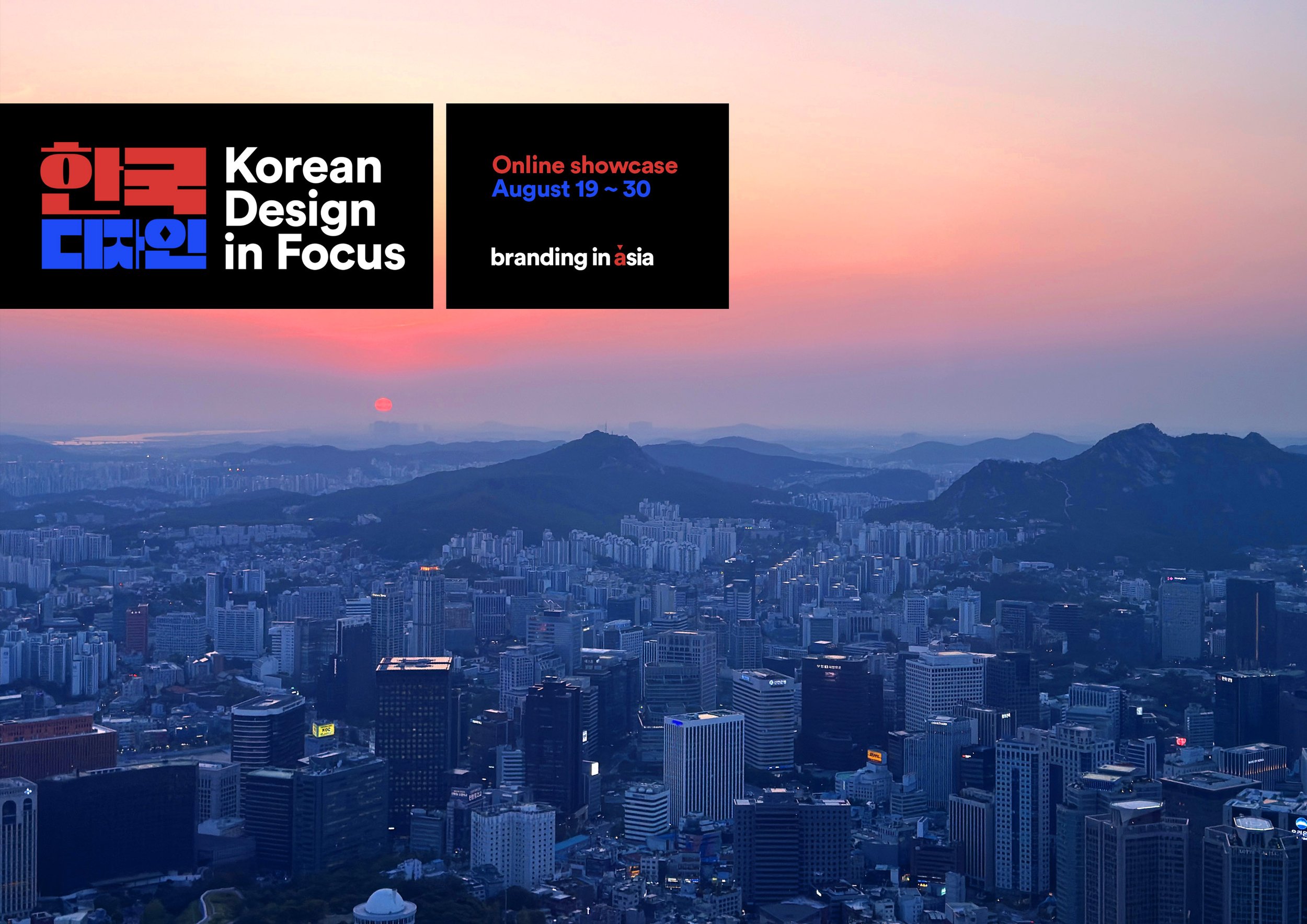
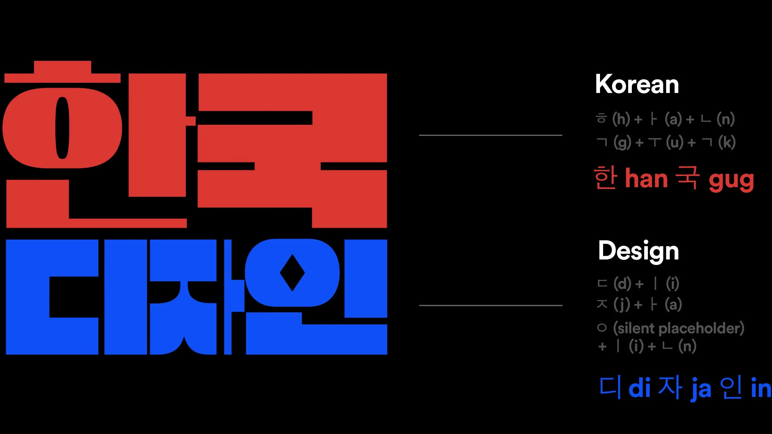
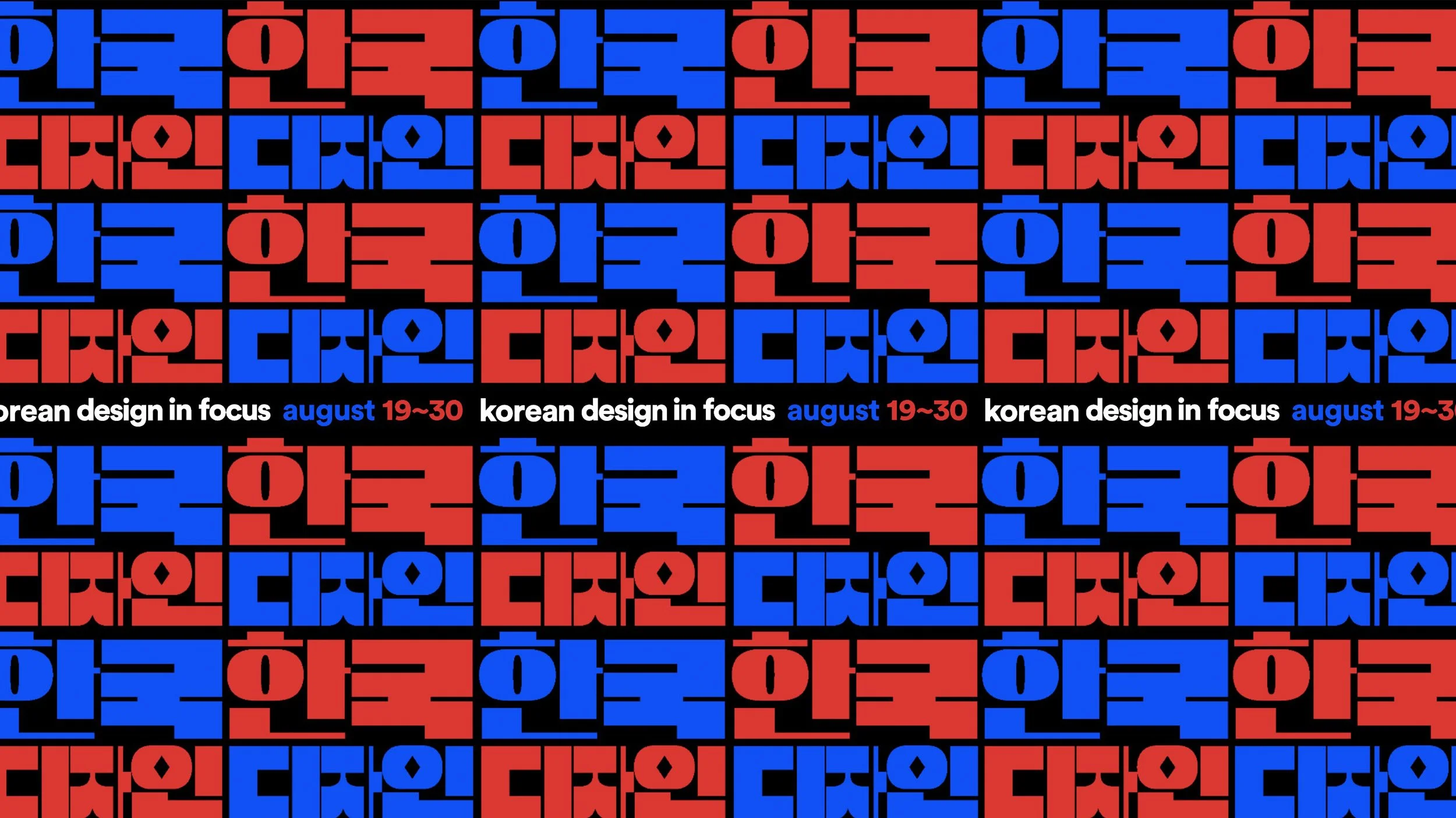
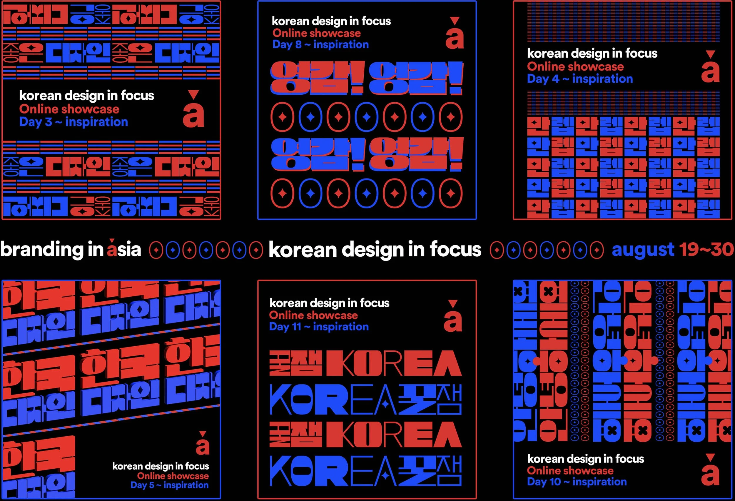
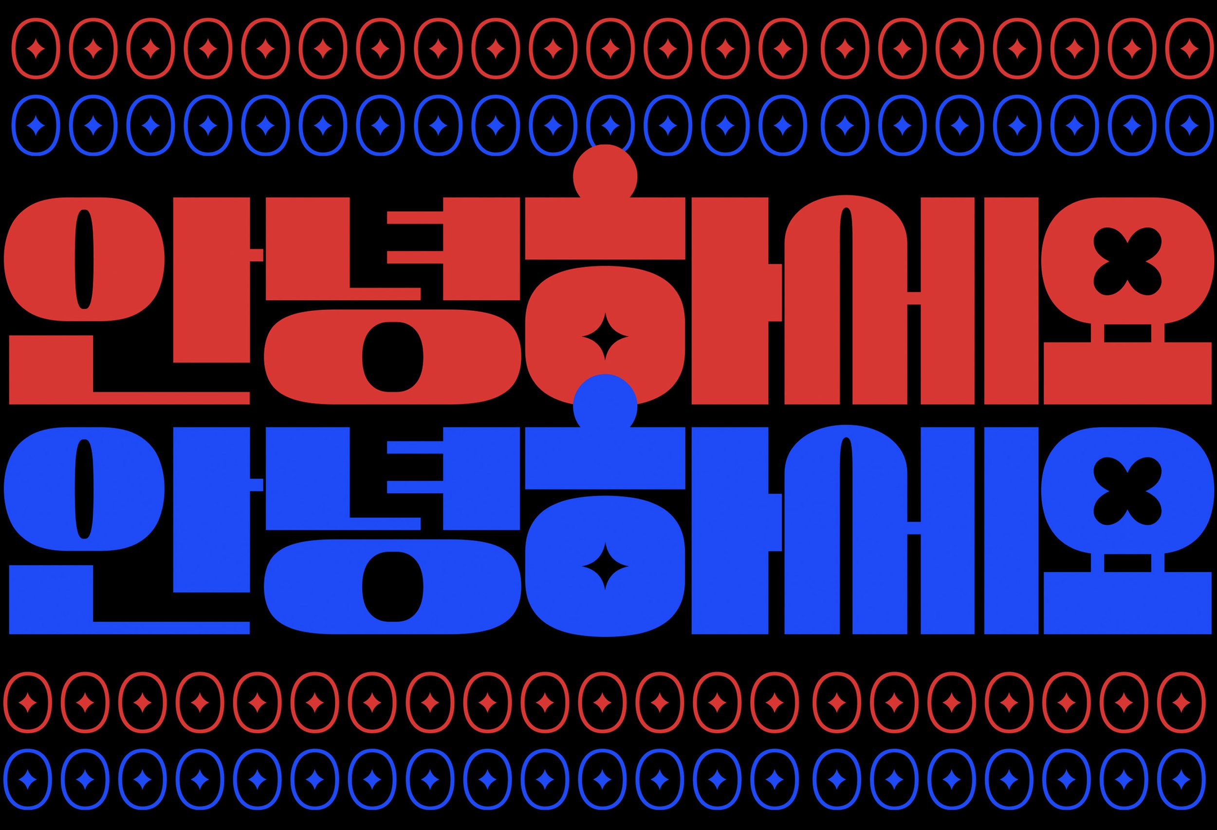
The KDIF identity sets "Korean 한국 Design 디자인" in DS Ddungsang Variable, by Seoul's Yoon Design Group — a blocky, geometric cut that honours Hangul's square composition rather than translating it into Latin proportions. Red and blue reference the flag without reaching for nationalism.
Thai Design in Focus
The Thai edition ran as a two-week daily journey through one of Asia's most distinctive design cultures: more than thirty features across graphic design, architecture, typography, textiles, furniture, and product design.
Conversations spanned Bangkok studios including Farmgroup and ADHOCK Studio; architects at Openbox, ASWA, and Architectkidd; type director Smich Smanloh of Cadson Demak on tradition and innovation in Thai type; and the handwoven textiles of Ausara Surface and Kachama K. Perez. At the institutional scale, the edition looked at the Thai Airways identity, the Bangkok Art and Culture Centre, and how Thai malls redefined experiential retail.
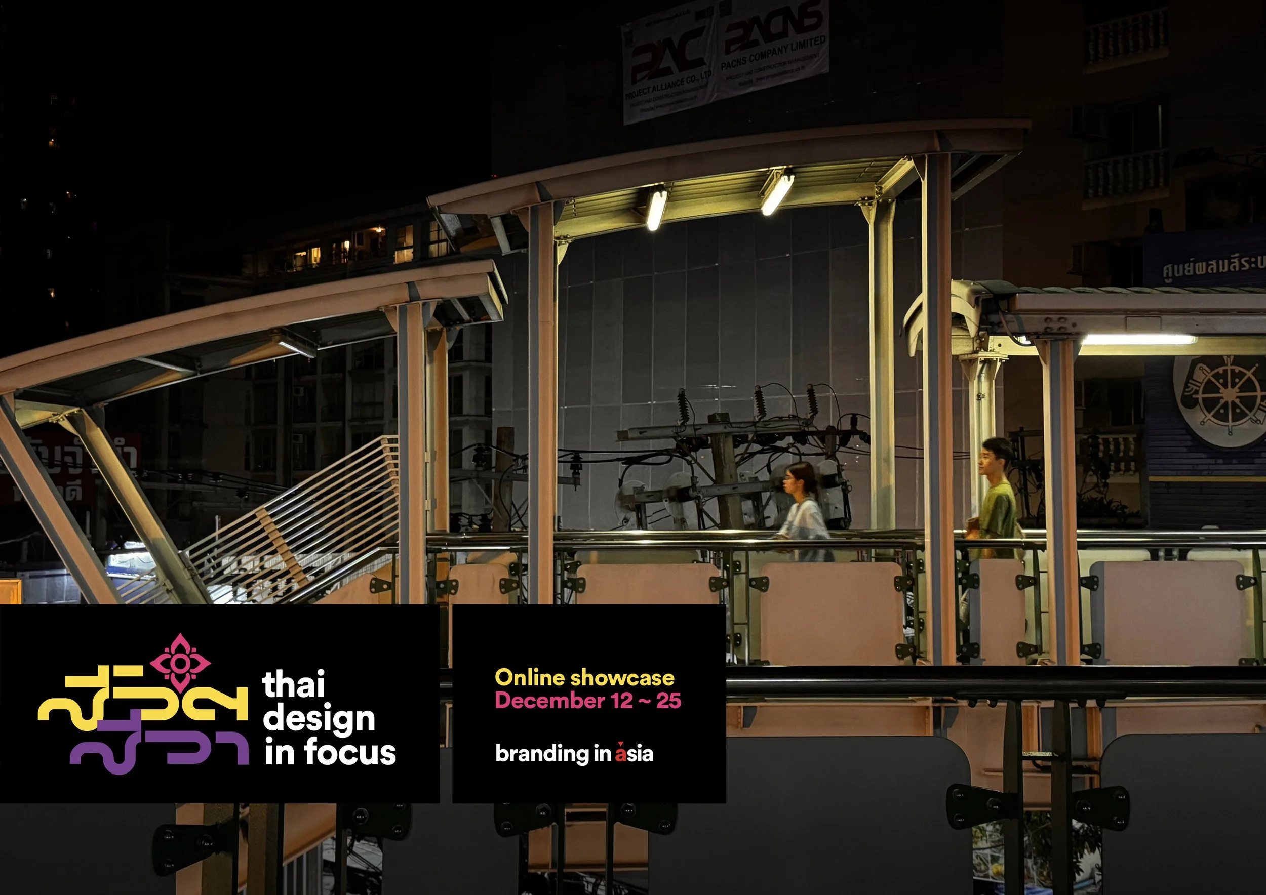
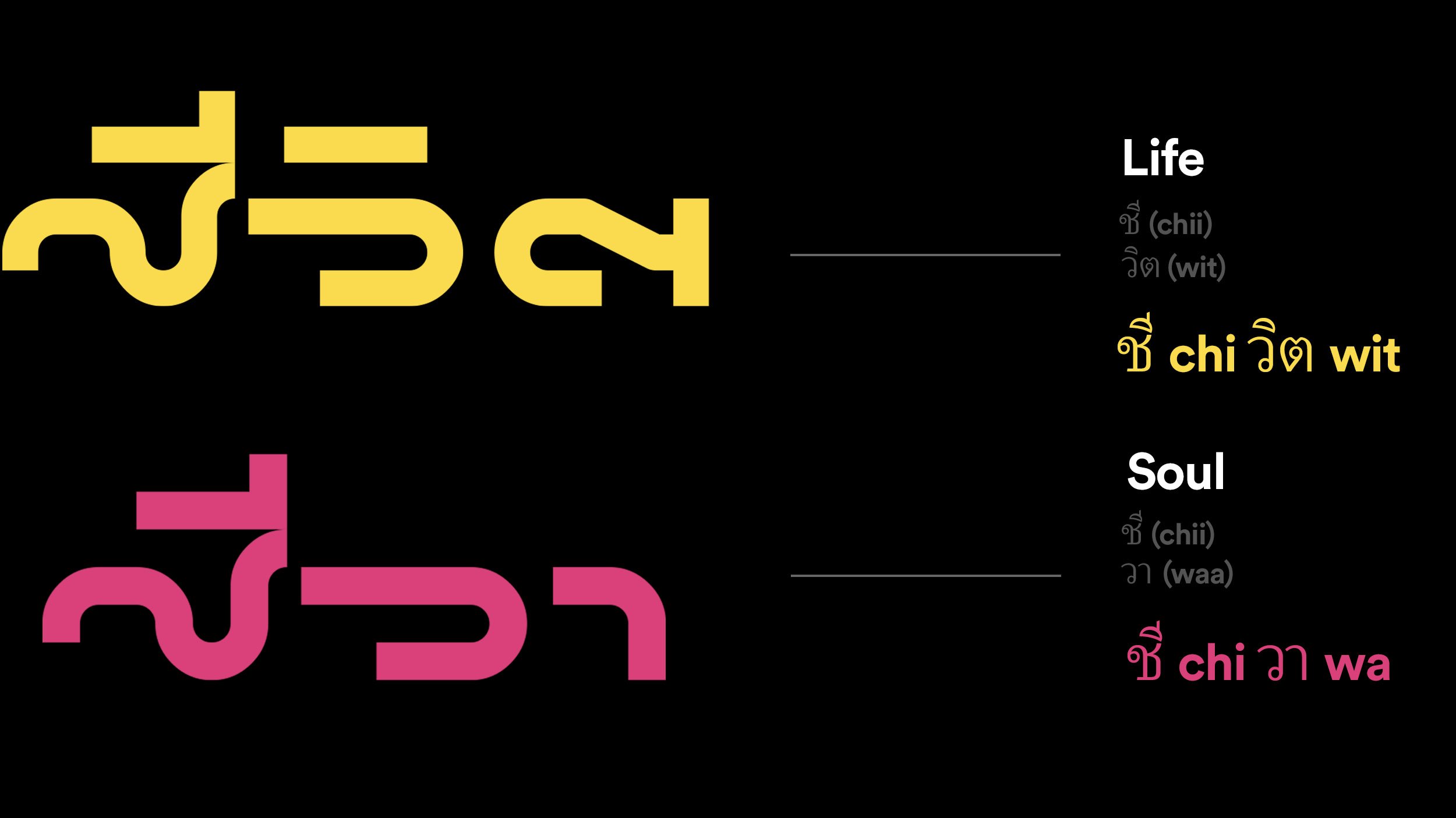
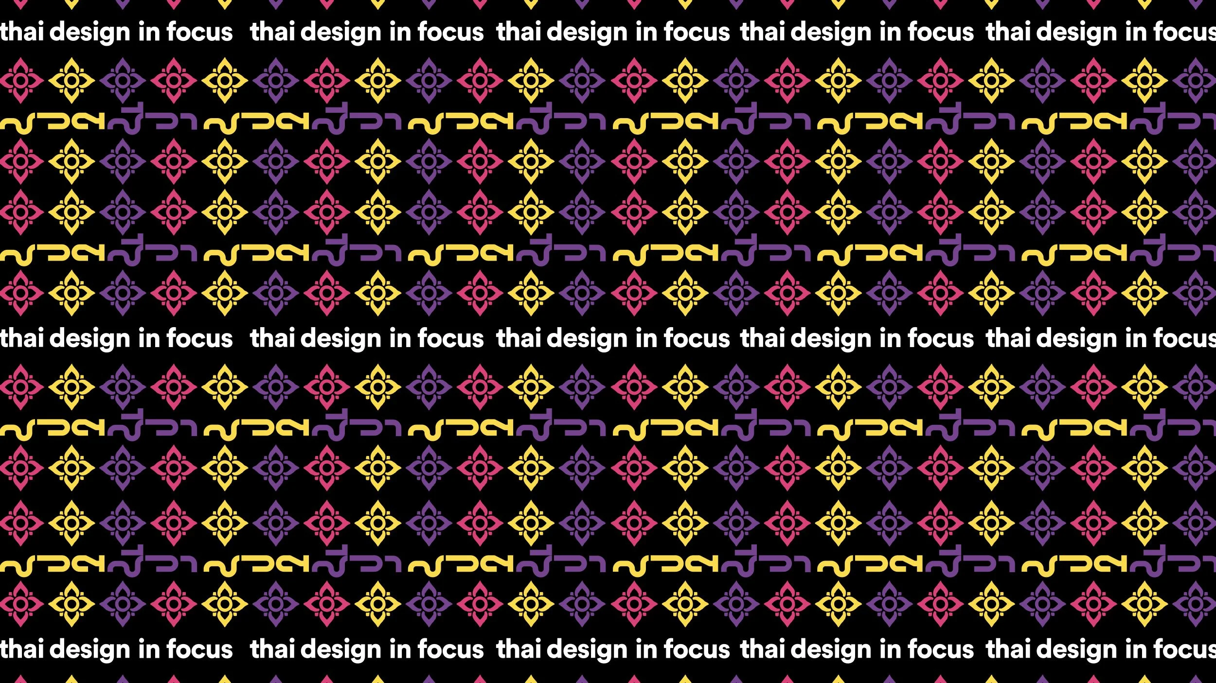
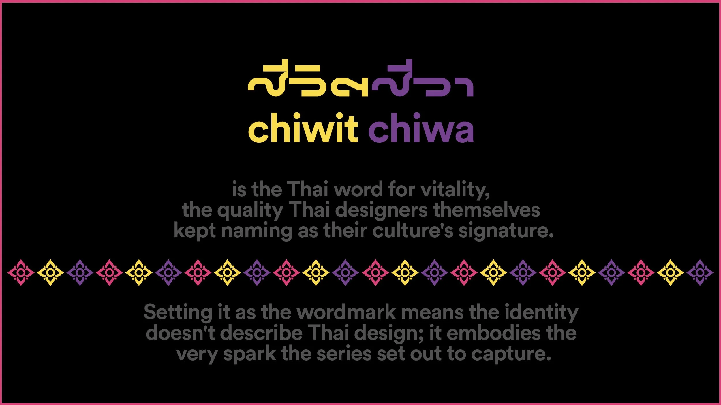
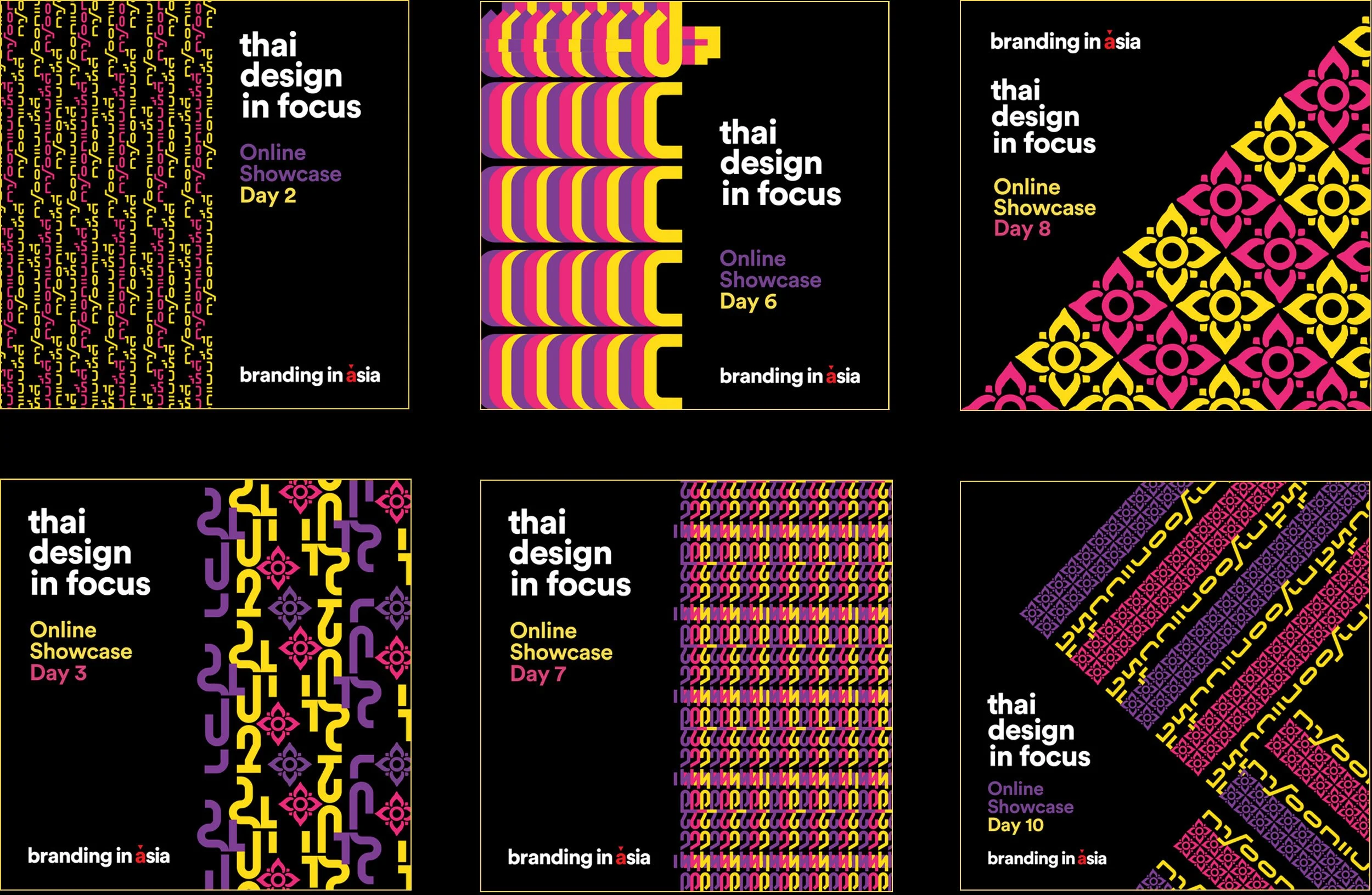
The TDIF identity draws on the country's script and its textiles. The wordmark sets the Thai title in SOV Rohan by Worawut Thanawatanawanich, released freely through Thailand's own f0nt.com community and chosen for its minimal strokes and its play. Above it sits a floral motif in magenta, from the ornamental lai Thai tradition of temple gilding.
In pattern, the identity changes register: wordmark and floral diamonds interlock in rows of yellow, magenta, and purple against black — the geometry of Thai silk weaving, where meaning is carried in repetition.
Indian Design in Focus
The Indian edition ran over two weeks in November 2025, exploring a design culture defined not by a single aesthetic but by what one contributor called a spectrum of expressions.
More than thirty features gathered voices across branding, architecture, interiors, fashion, and product design: Anthony Lopez of Lopez Design on why Indian design is layered and adaptive; Ashwini Deshpande of Elephant Design on bold design as strategic necessity; Roshni Kavina, National Creative Director at Saatchi & Saatchi India, on heritage as pride; Neha Tulsian of NH1 Design on curiosity and strategy; and architects from STHAPATI, The Purple Ink Studio, and Gaurav Roy Choudhury Architects. Essays like The Logic of More traced the evolution of Indian maximalism — a language that values density over emptiness, storytelling over stillness.
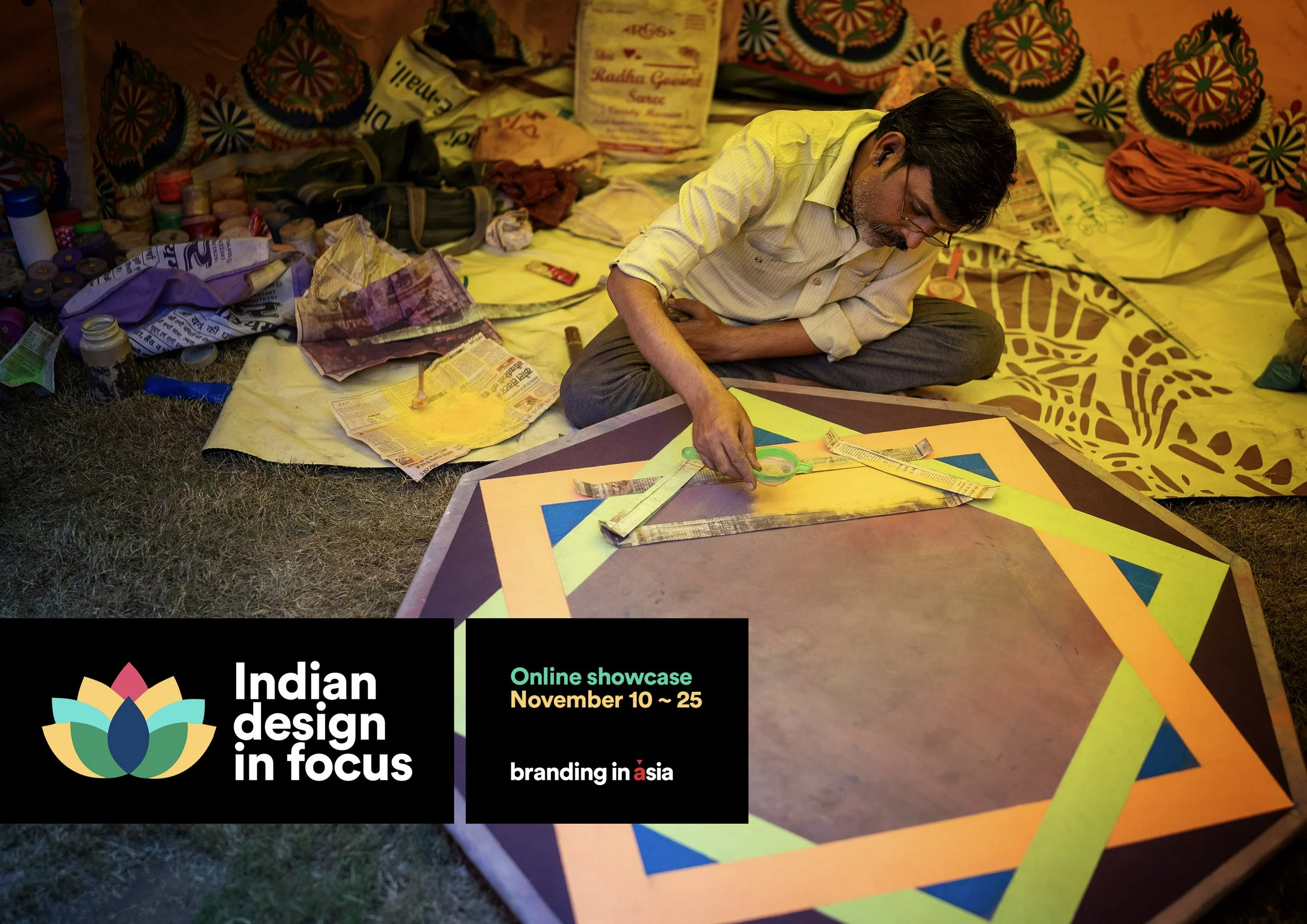
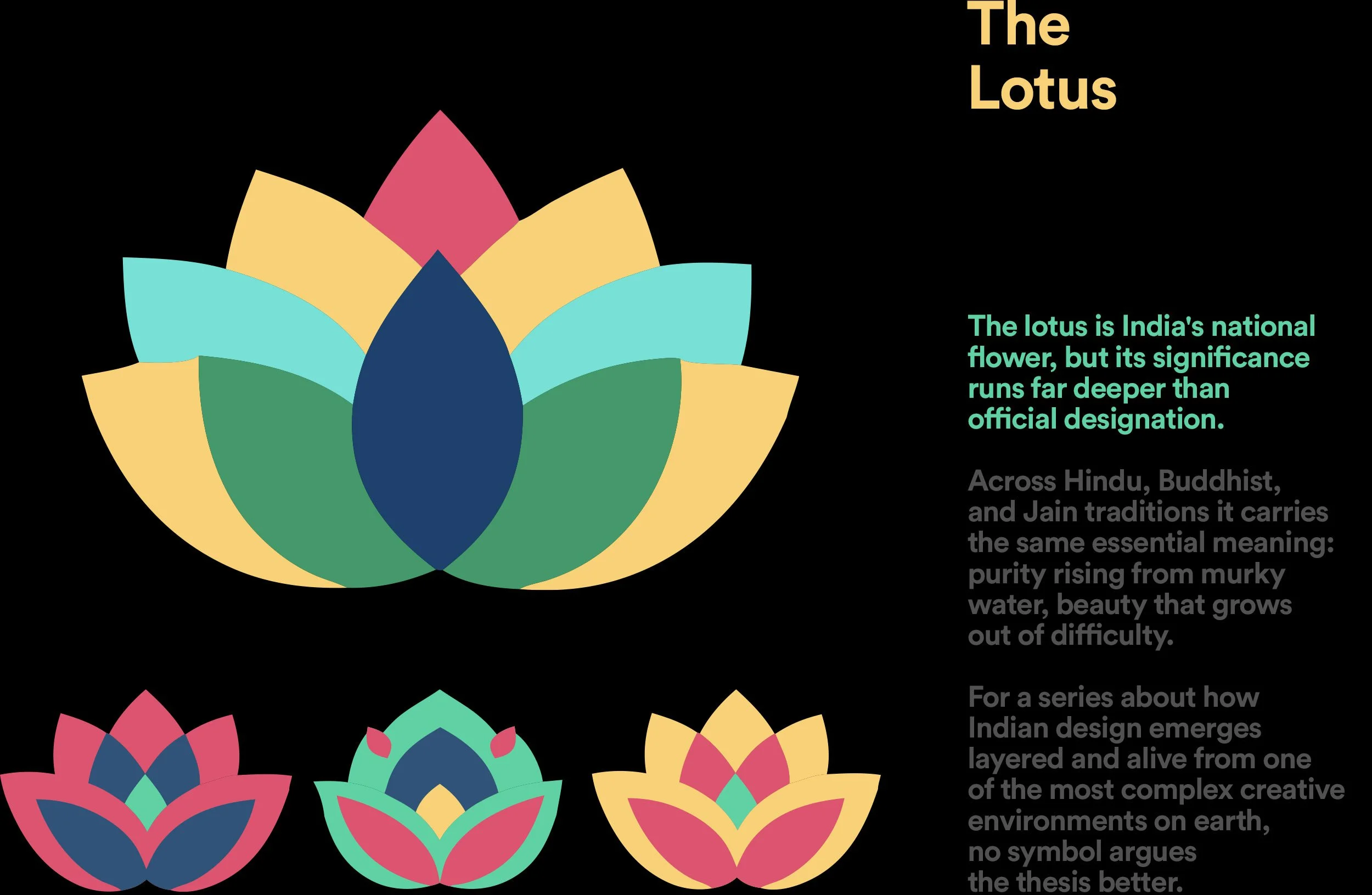
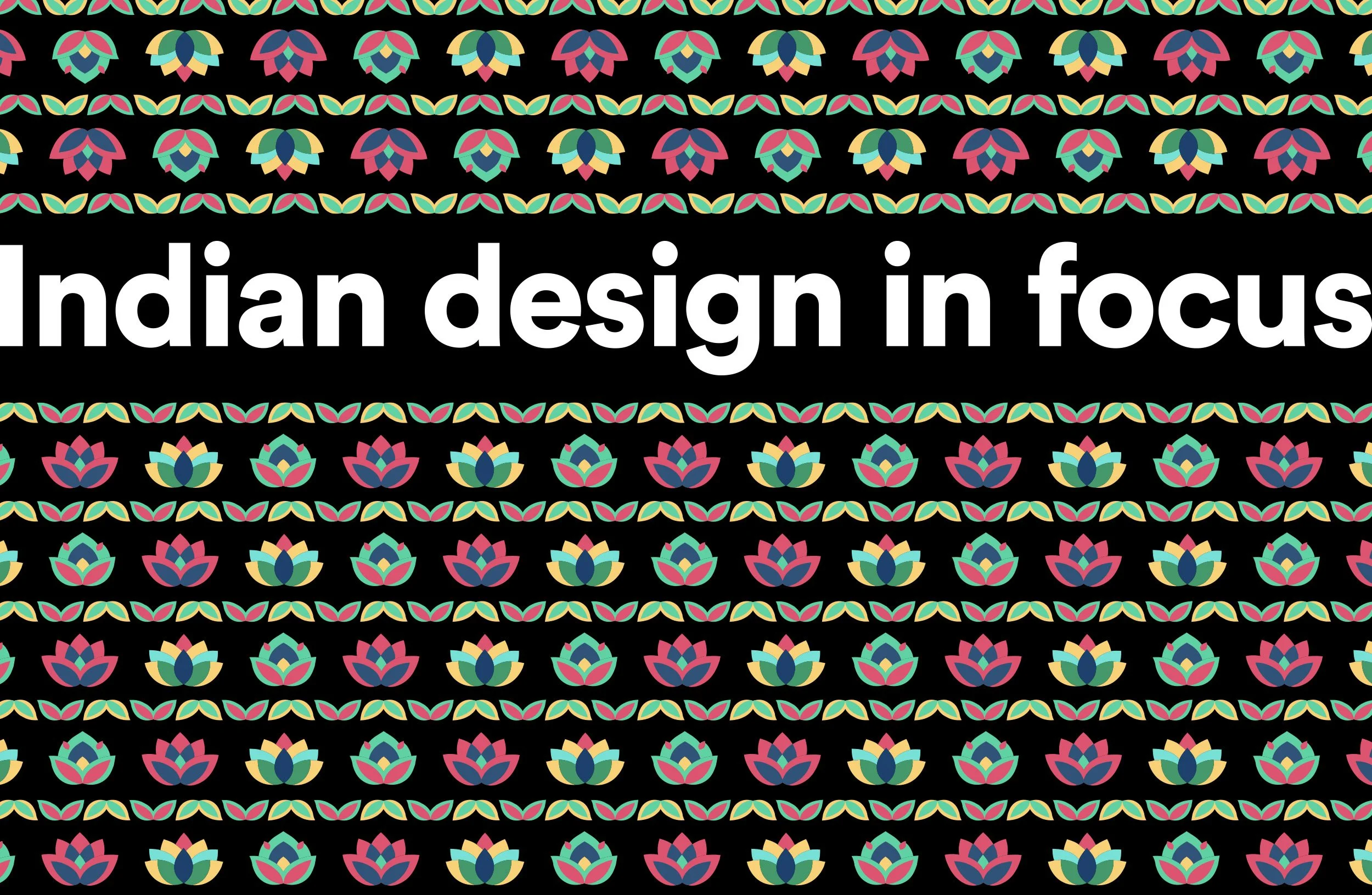
The IDIF identity takes that maximalism on its own terms. At its heart is a lotus, rendered flat and geometric, repeated in three rotating colourways so that no single version is the logo. The multiplicity is the point.
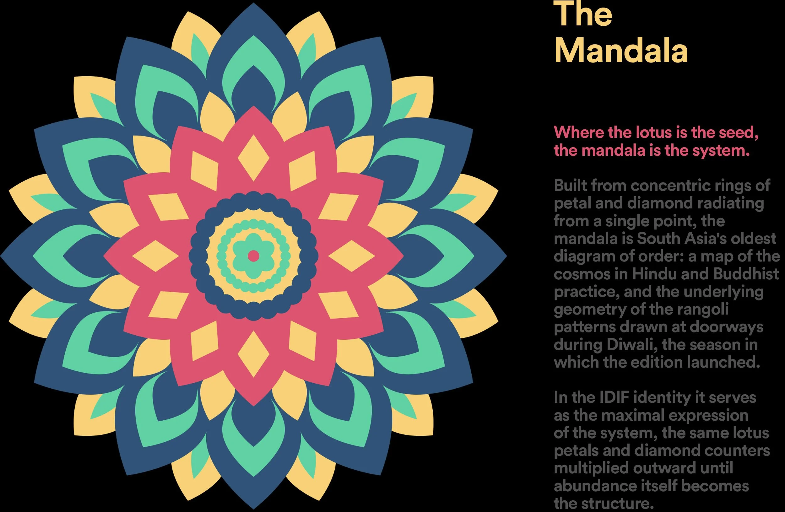
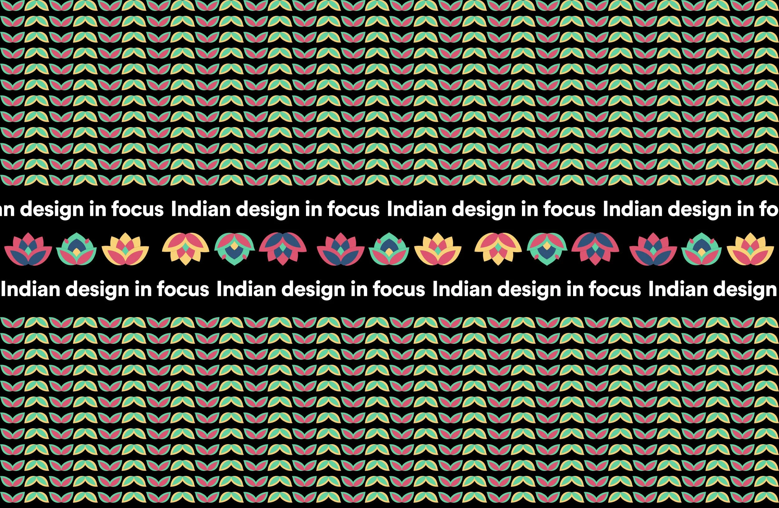
The palette, Contemporary India, pairs indigo and marigold with vivid pink and mint — pulled from the everyday streetscape as much as from festival tradition. In pattern, the lotus multiplies into ordered rows bordered by vines, following the logic of block-printed textiles, then gathers into a rangoli medallion: the radial geometry drawn at thresholds during Diwali, the season the edition launched.
Across every edition our role spans the conceptual and the crafted — co-developing the series format and editorial voice with Branding in Asia, designing each national identity in collaboration with the people who work in that visual culture, and framing each story for an international audience of designers, brand leaders, and policymakers.
Design in Focus continues, each edition asking the same question of a new nation: what happens when a country decides that design matters?