Kobraiya
Our Scope of Work Included :
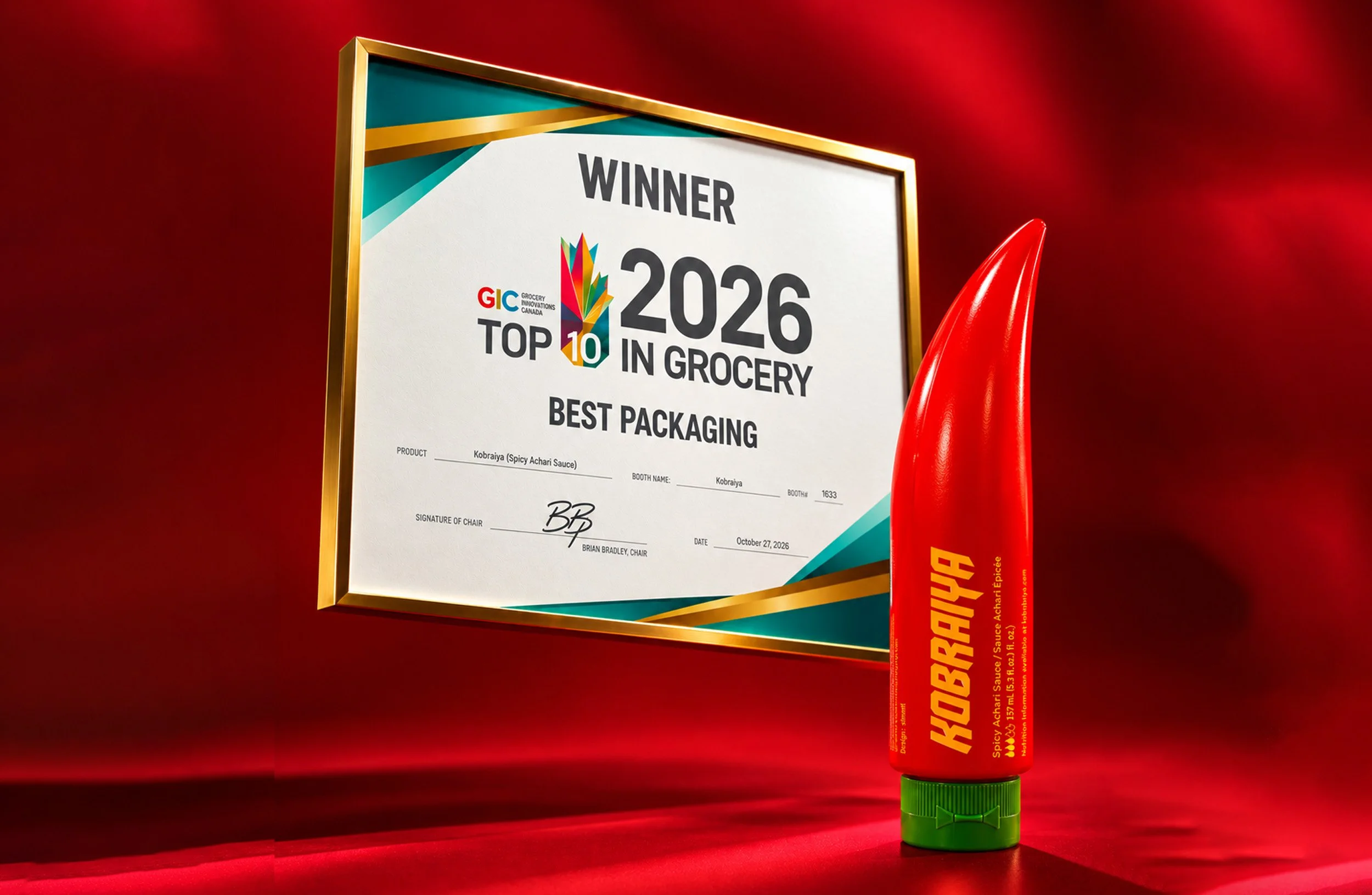
Brand identity, packaging and custom typeface for a Bengali-rooted hot sauce. / Best Packaging, GIC Top Ten in Grocery 2026.
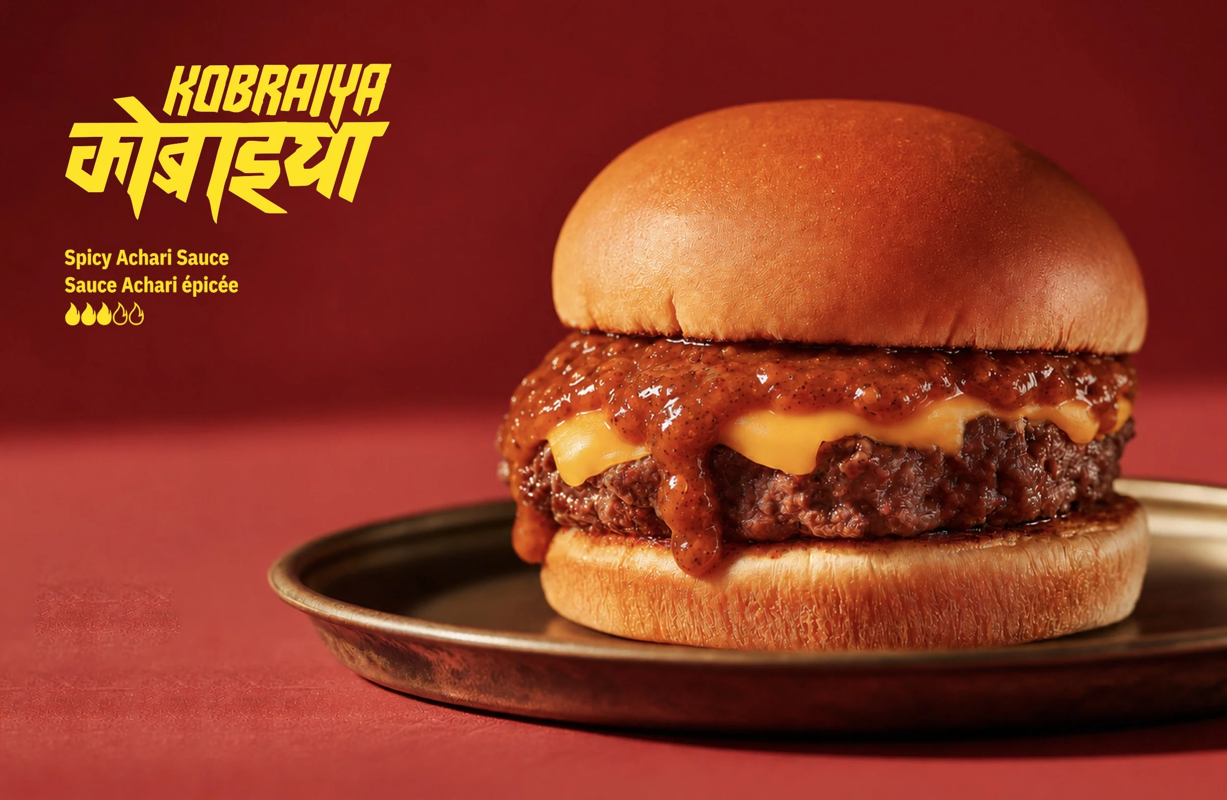
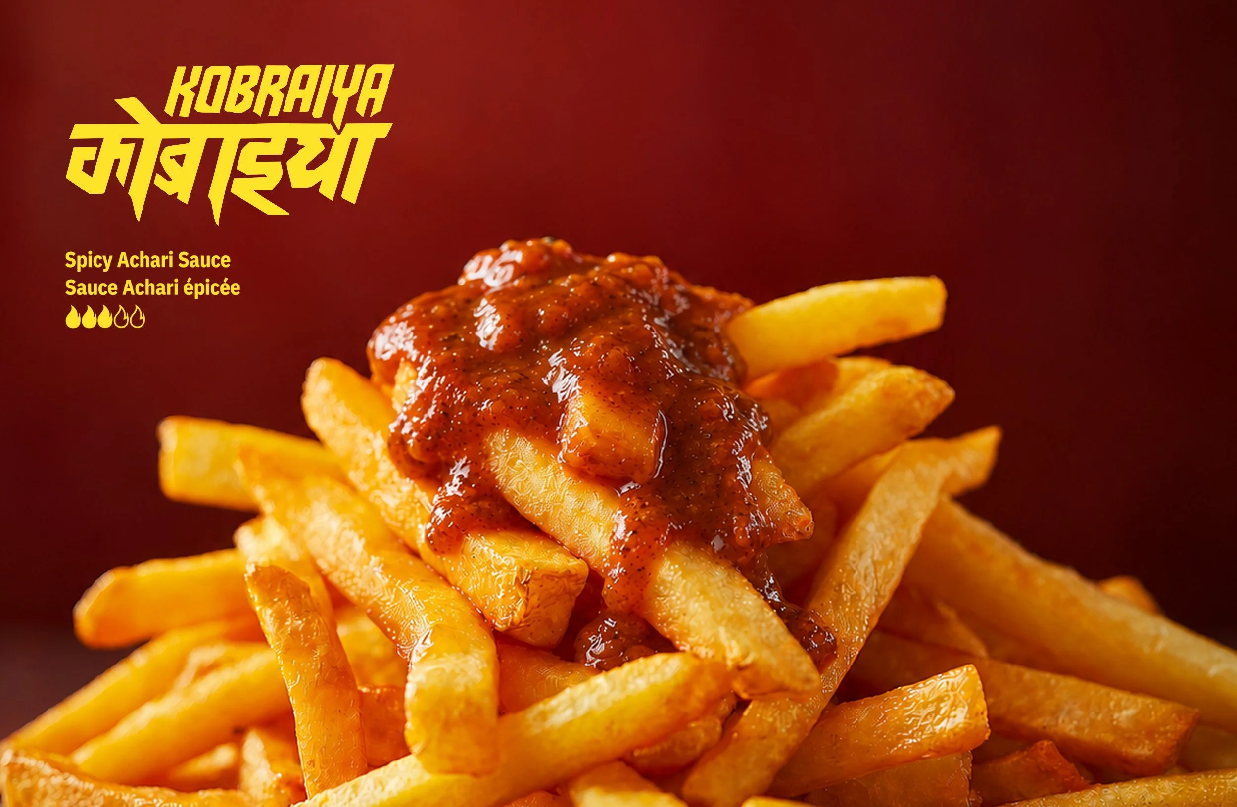
The hot sauce aisle had perfected boring: glass bottles, flame graphics, skulls, heat scales shouting “insanely hot.” Kobraiya came with something the category didn’t have, which was Bengali heat. That means jhaal and achari, tang and depth, more than just burn.
Our job was to carry that flavour onto North American shelves without watering it down or dressing it up as exotica.
The origin
Kobraiya starts in a kitchen. The sauce is built on Chhanda Das’s spicy chilli achar, the family recipe of founder Tim Das’s mother.
We came on as creative partners, and over roughly a year and a half we turned a recipe into a brand.
Tim Das / Ibraheem Youssef Founders ~ Birdway CPG Commercialization & MVP / Ancord Design Industrial Design
K1 Packaging Group Package Production / Pure Edibles Production & Manufacturing / Culinary Science Consulting Recipe & Food Safety
Food Industry Counsel LLP Compliance & Legal guidance
The identity
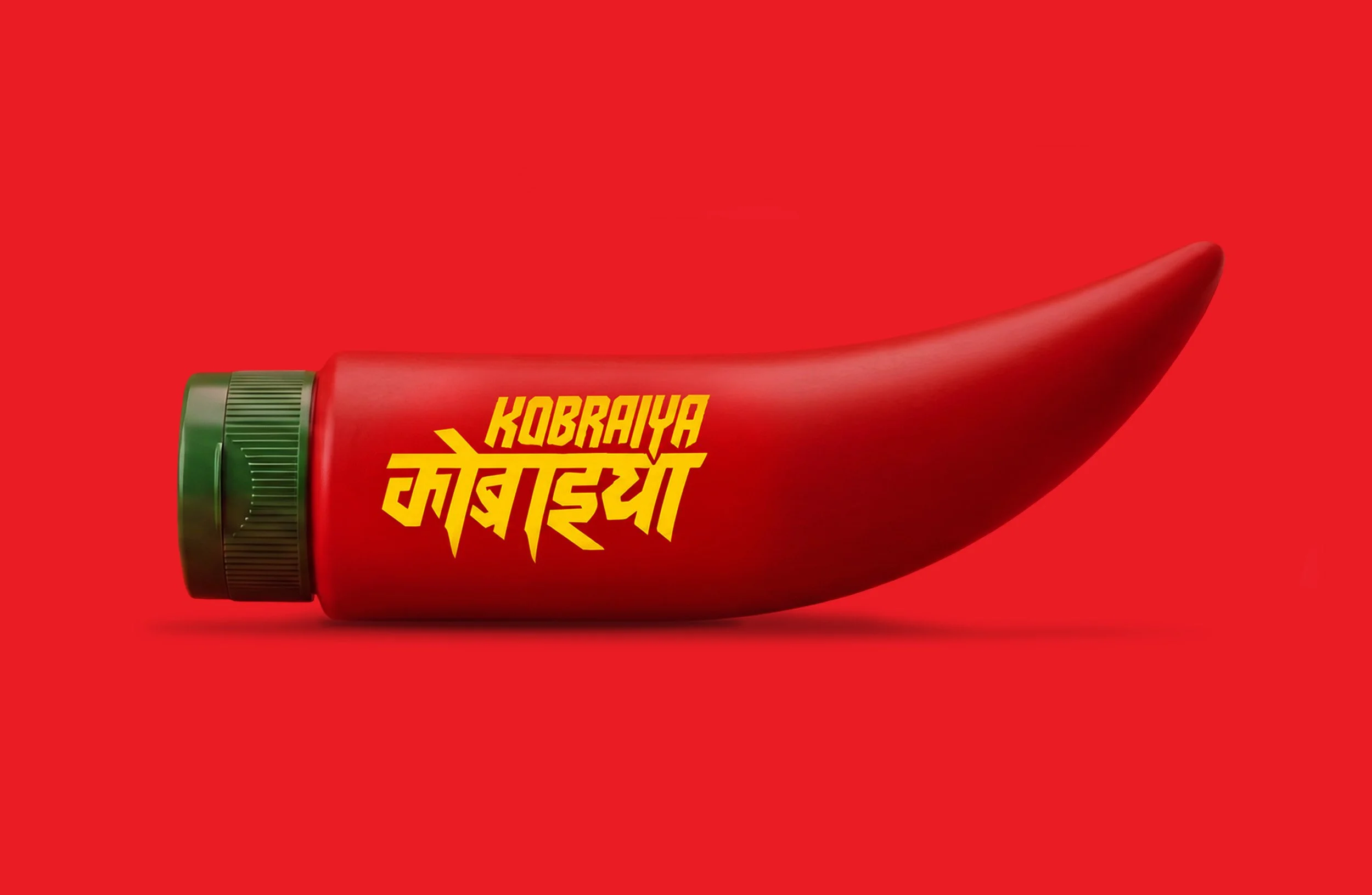
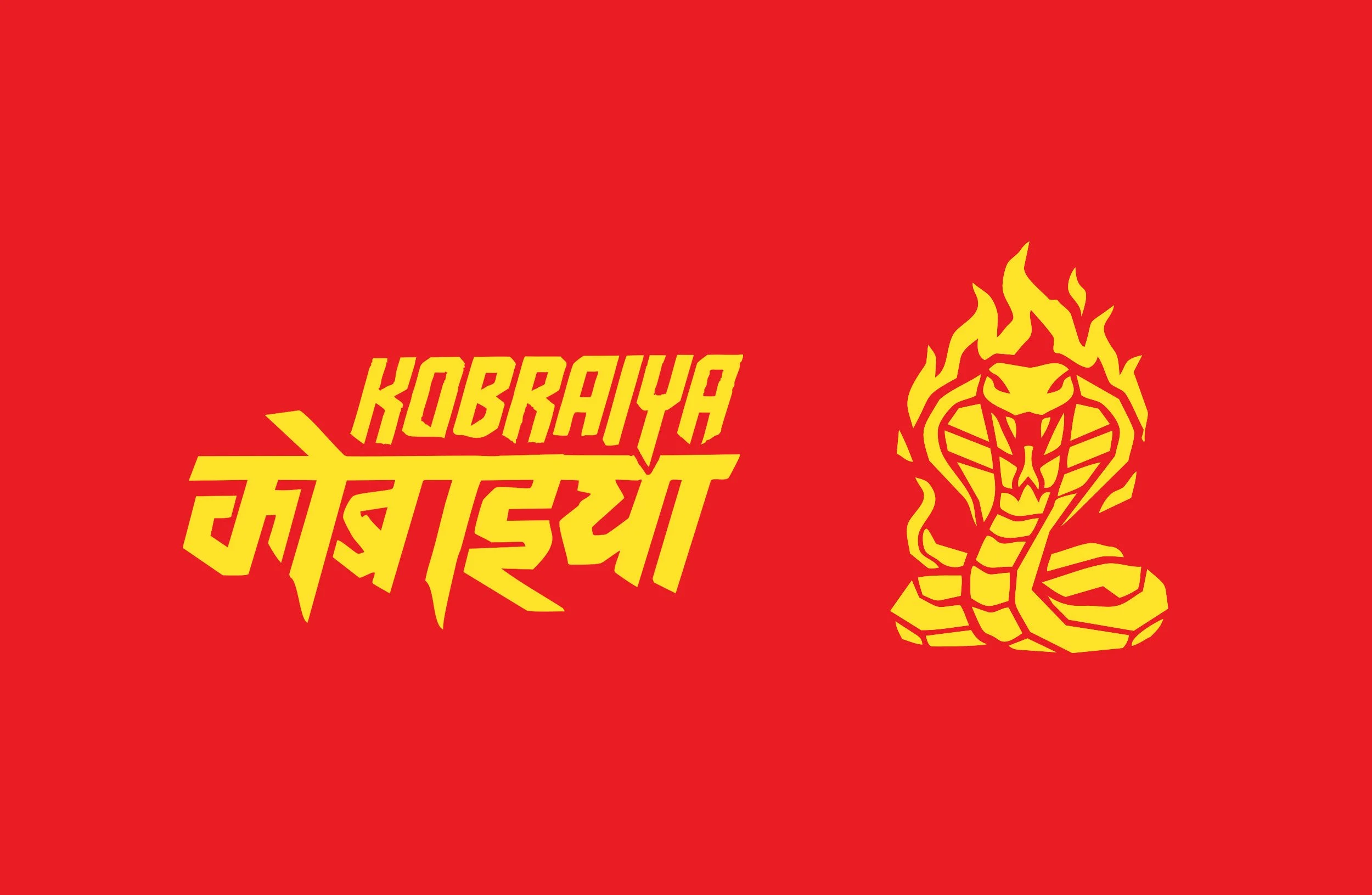
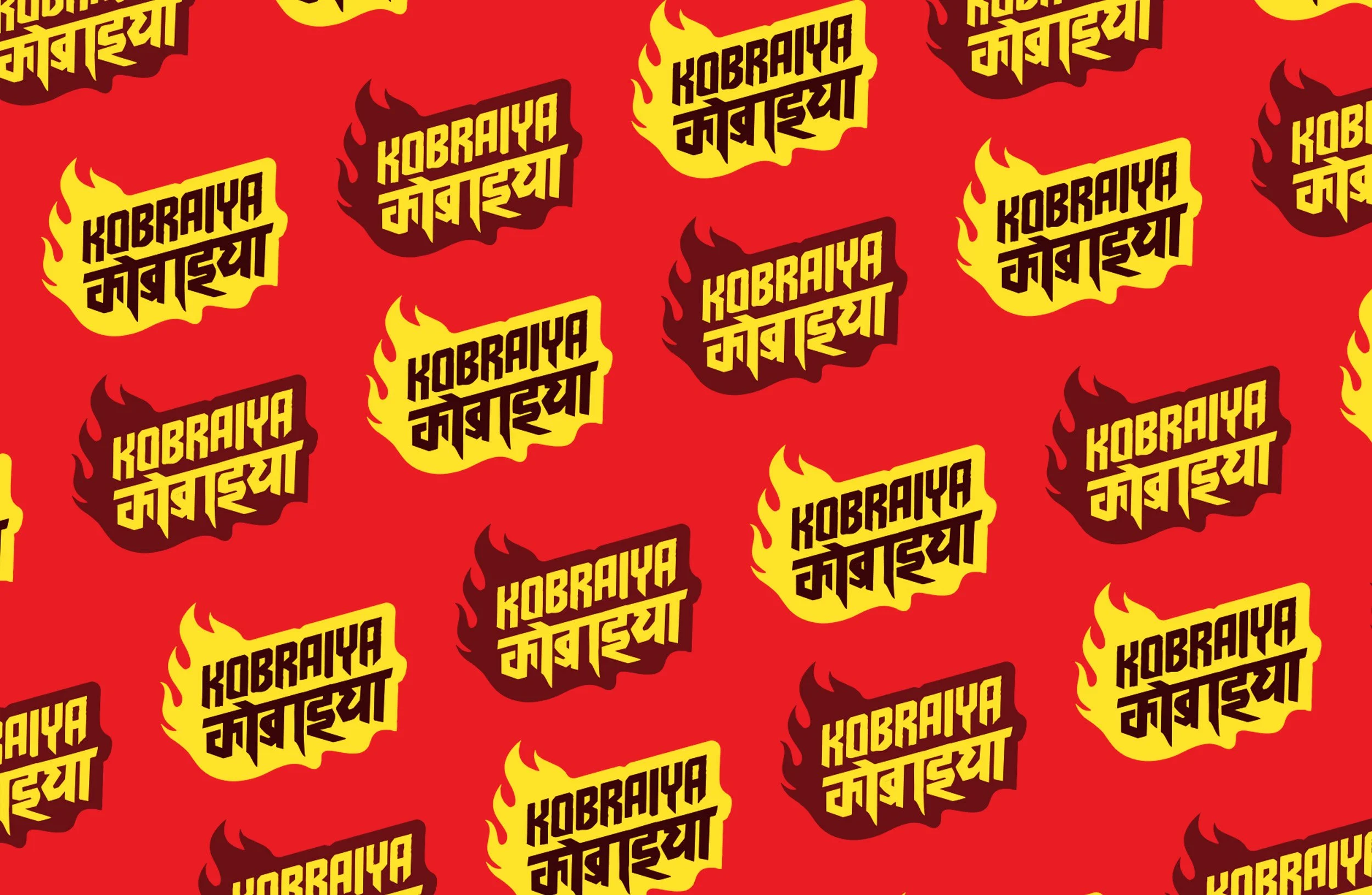
The wordmark. Devanagari meets Latin. Diaspora brands usually tuck heritage script under the English name. We flipped the hierarchy. The letterforms are angular, italic and drop-shadowed, a kobra strike caught mid-motion. Think street art, Bollywood poster and hot sauce swagger in one lockup.
The typeface. Kobraiya Sans is a custom face in Latin and Devanagari, built by STNMTL with Mumbai-based Grafiqs Studio. It’s set in all caps and carries the same spirit in both scripts, so the brand speaks two alphabets with one voice.
The palette. There are six colours, named for what’s in the jar and what’s on the label: Laal, Haldi, Achari, Tetul, Kacha Aam, and Gokhra, the cobra. They come from Durga Puja pandals, roadside chaat stalls and turmeric drying in the sun. None of them are committee colours.
The pattern. The kobra scale is an irregular diamond texture drawn from the snake’s skin. It also echoes jamdani weave and alpona floor painting. It works as armour on the pack and texture everywhere else.
The voice. Kobraiya talks in Benglish and Hinglish, the way the diaspora actually talks. “Uff baba.” “Ektu lagbe?” “Shob kichu te!” Code-switching is natural and never decorative. A word here and a phrase there make non-Desi audiences curious and Desi audiences feel at home.
The tube
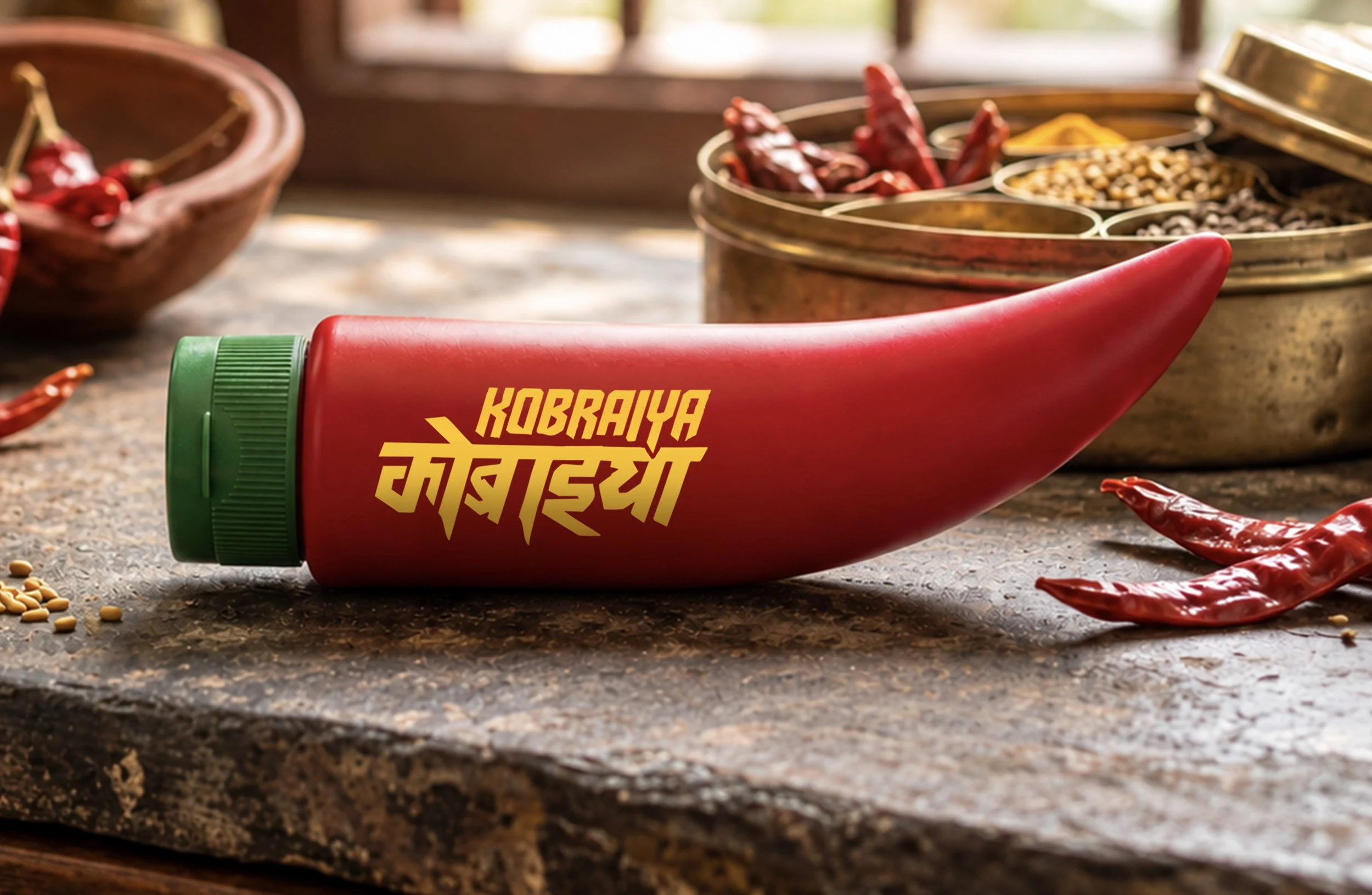
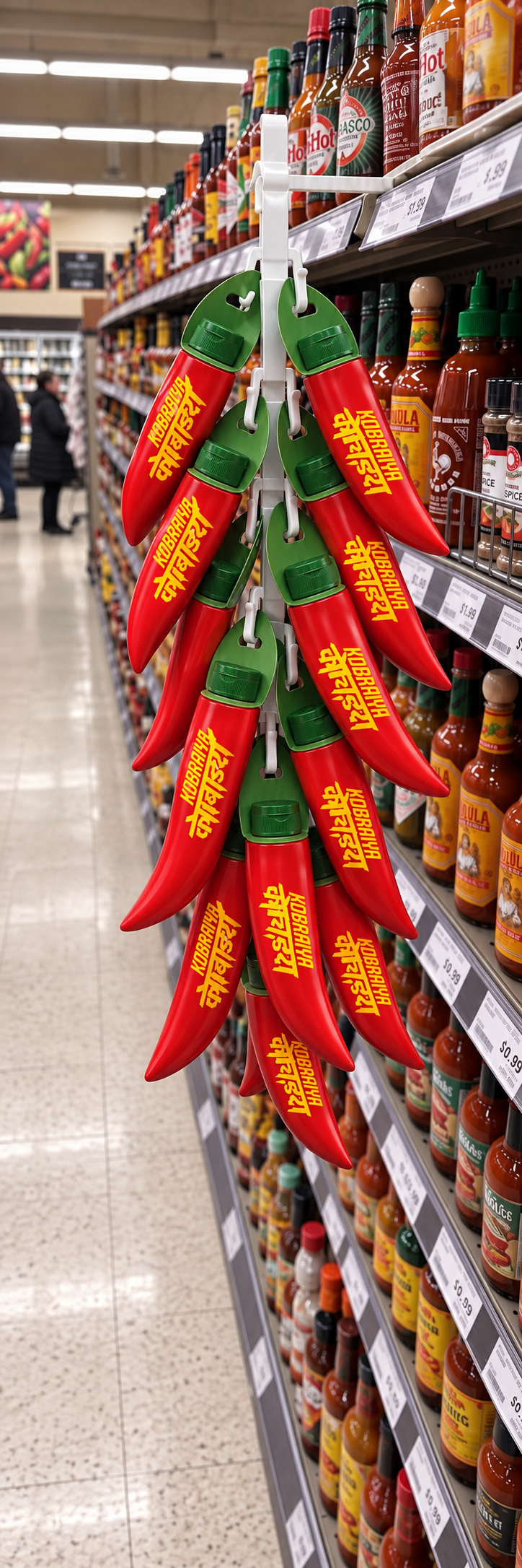
The pack is a squeezable tube in the shape of a chili. The green cap is the stem. It hangs on a peg hook instead of queuing up with the bottles, so it reads from across the aisle. It’s built for a precise squeeze: spread it, dip it, dot it. The label is bilingual and the tube holds 157 mL.
It looks like what it is. That’s the whole idea.
The award
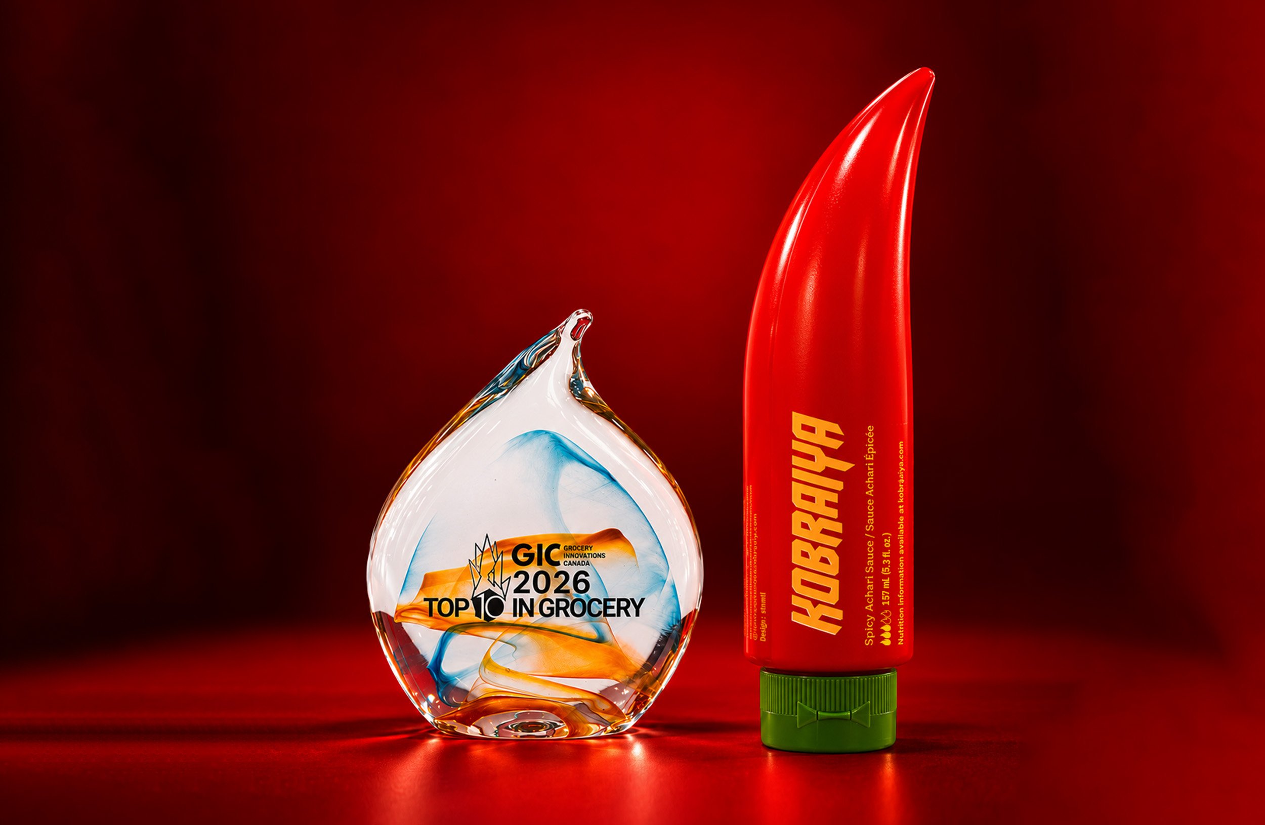
First show. First day. Best Packaging.
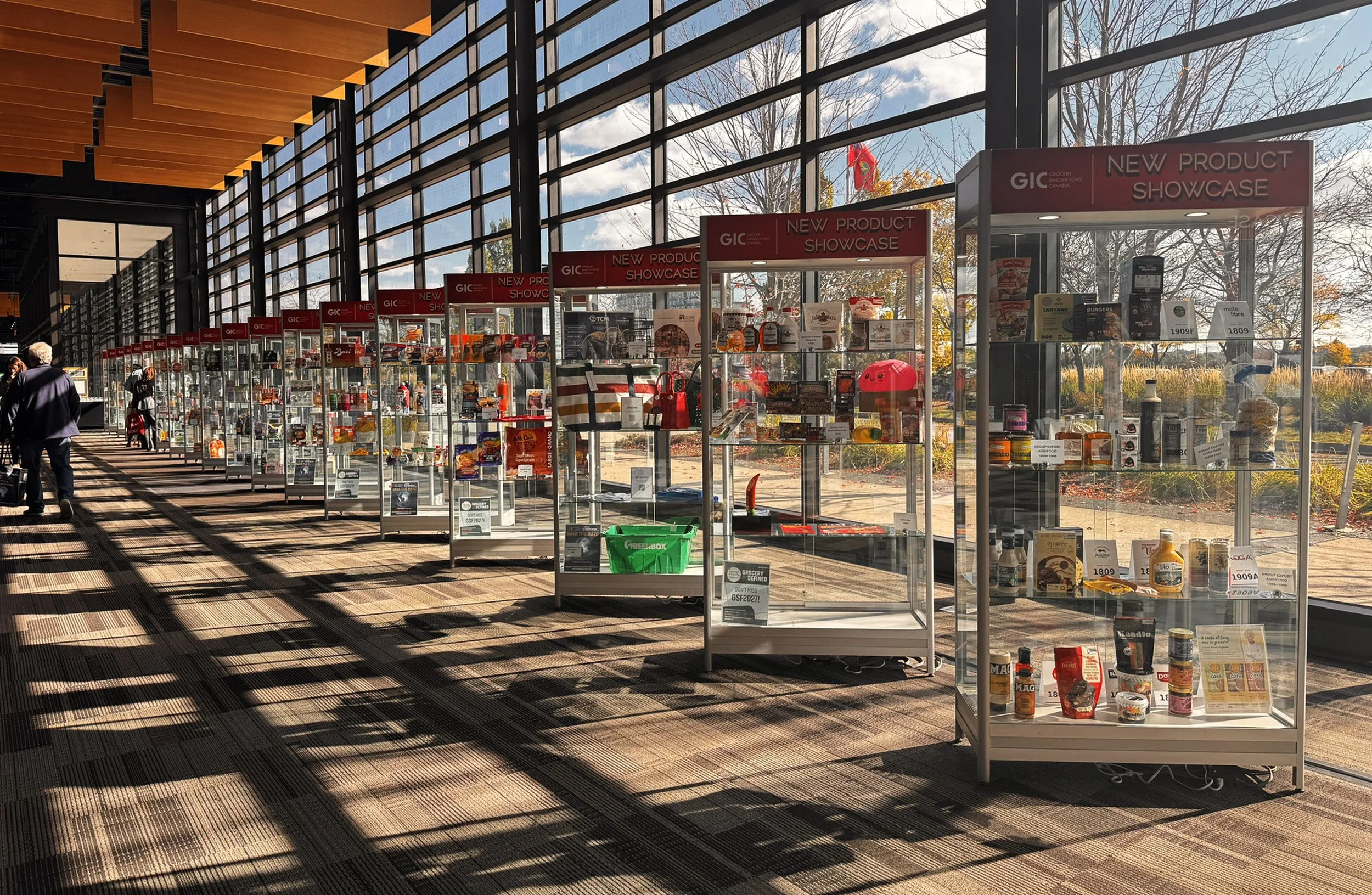
Kobraiya made its debut at Grocery Innovations Canada in Toronto on October 27–28, 2026, at booth 1633, under a giant custom 3D printed replica of our product. On day one it won Best Packaging in the 2026 Top Ten in Grocery. The winners are picked from New Product Showcase entries by a vote of editors from leading trade publications and a retail committee.
The awards are presented by the Canadian Federation of Independent Grocers.
Heat that watches before it strikes. This one struck early.