Café Olimpico ///// Espresso
The Scope of Work Included :
Brand Identity System ~ Package Design ~ Custom Illustration & Typography
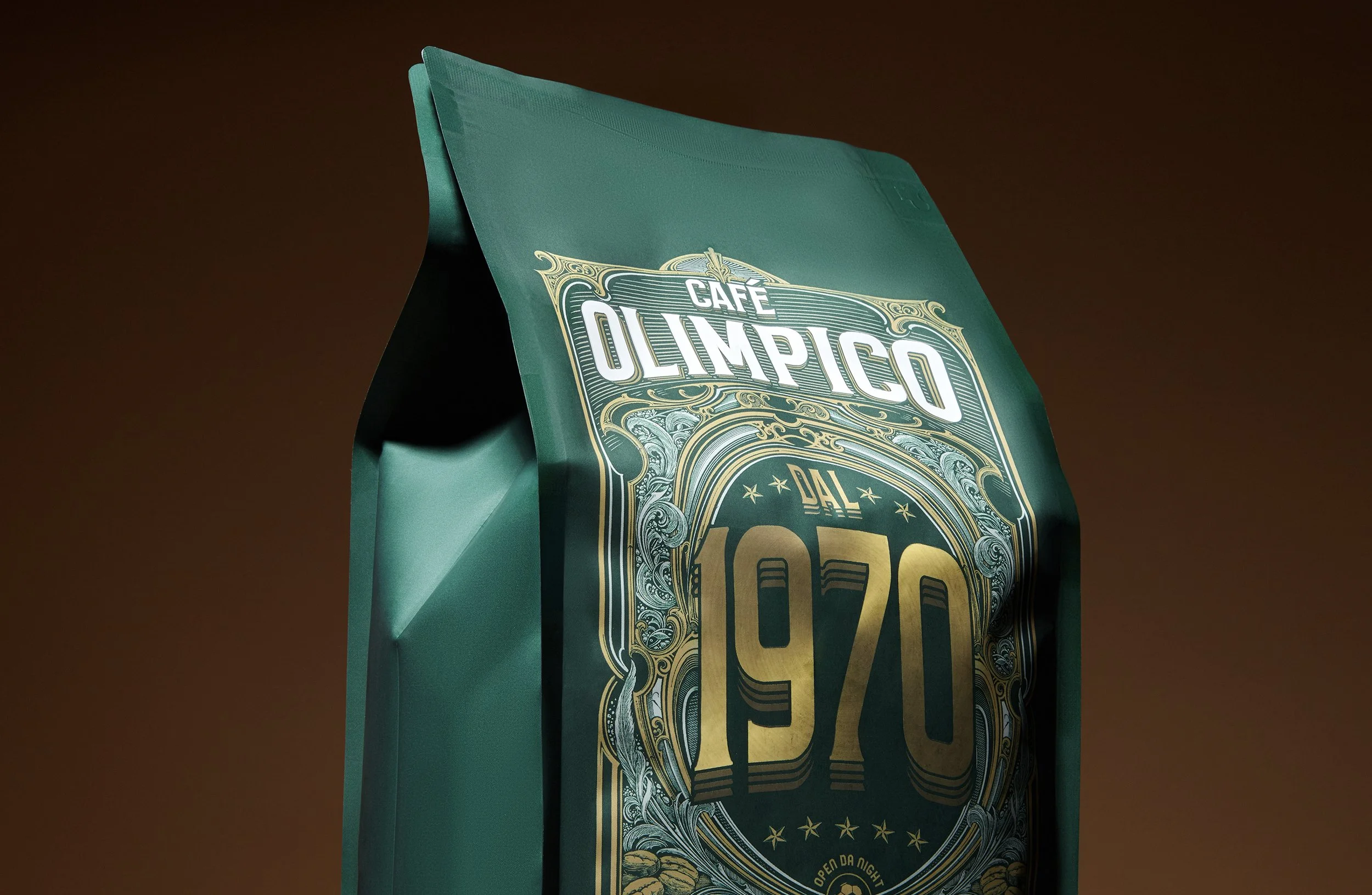
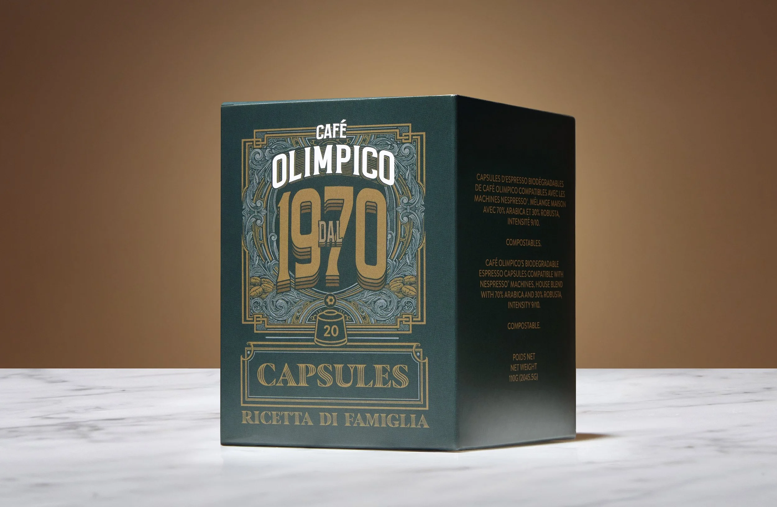
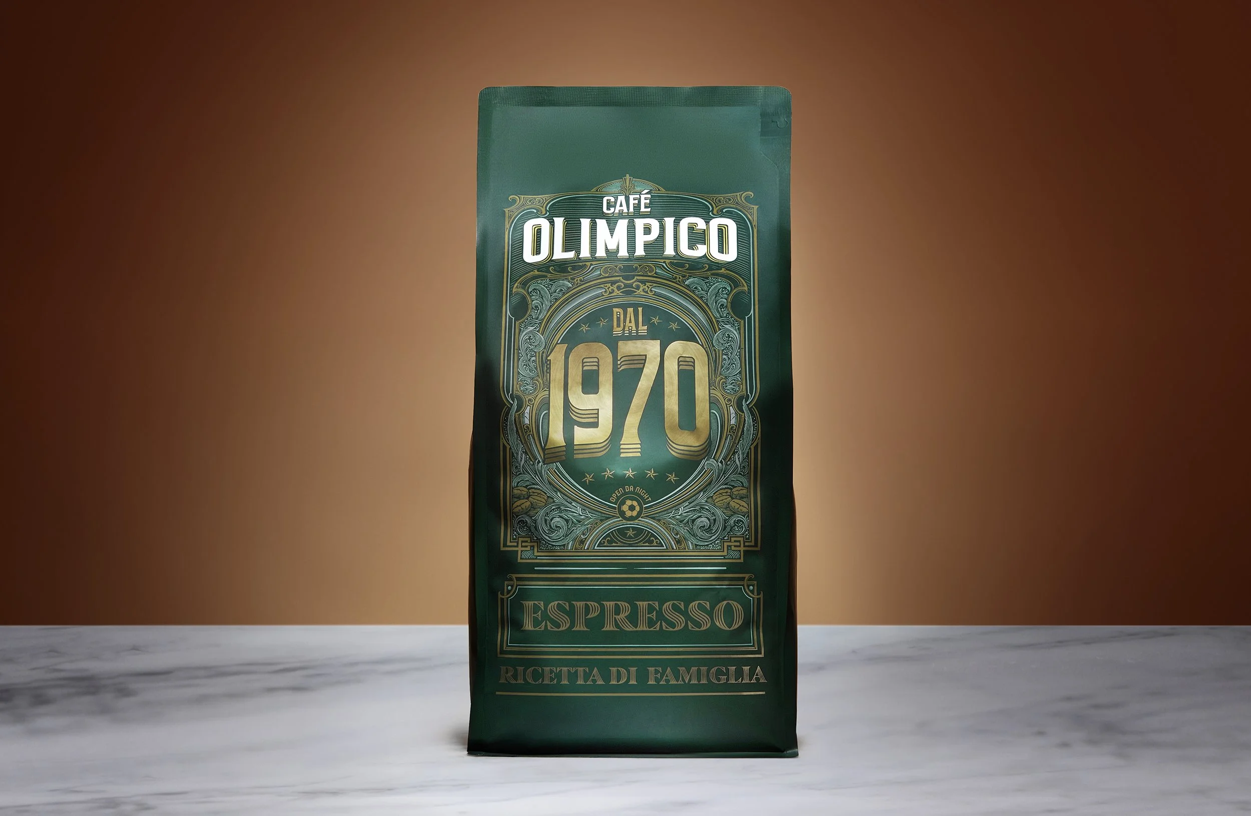
Fifty-five years after Rocco Furfaro opened the doors in Mile-End, Café Olimpico made a big call. The Olympic flame steps back. The founding year steps forward. From here on, every product the café puts into retail is built around two words and a number... Dal 1970. We were asked to design that system and launch it across the first two products in the range: a whole-bean espresso bag and a box of Nespresso-compatible capsules.
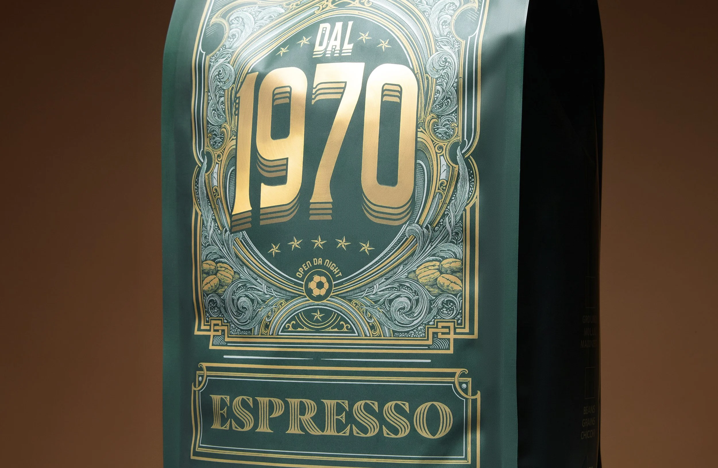
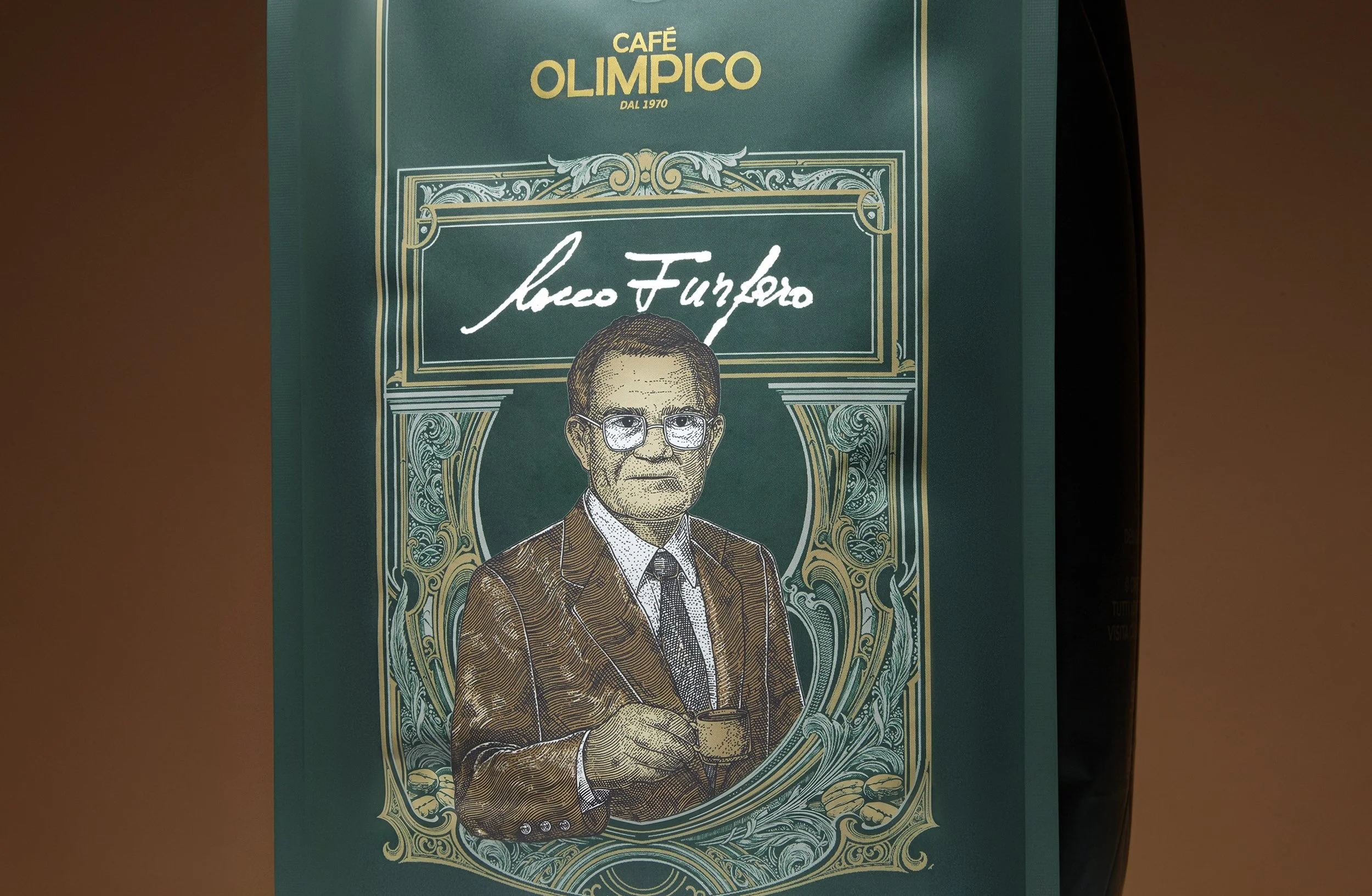
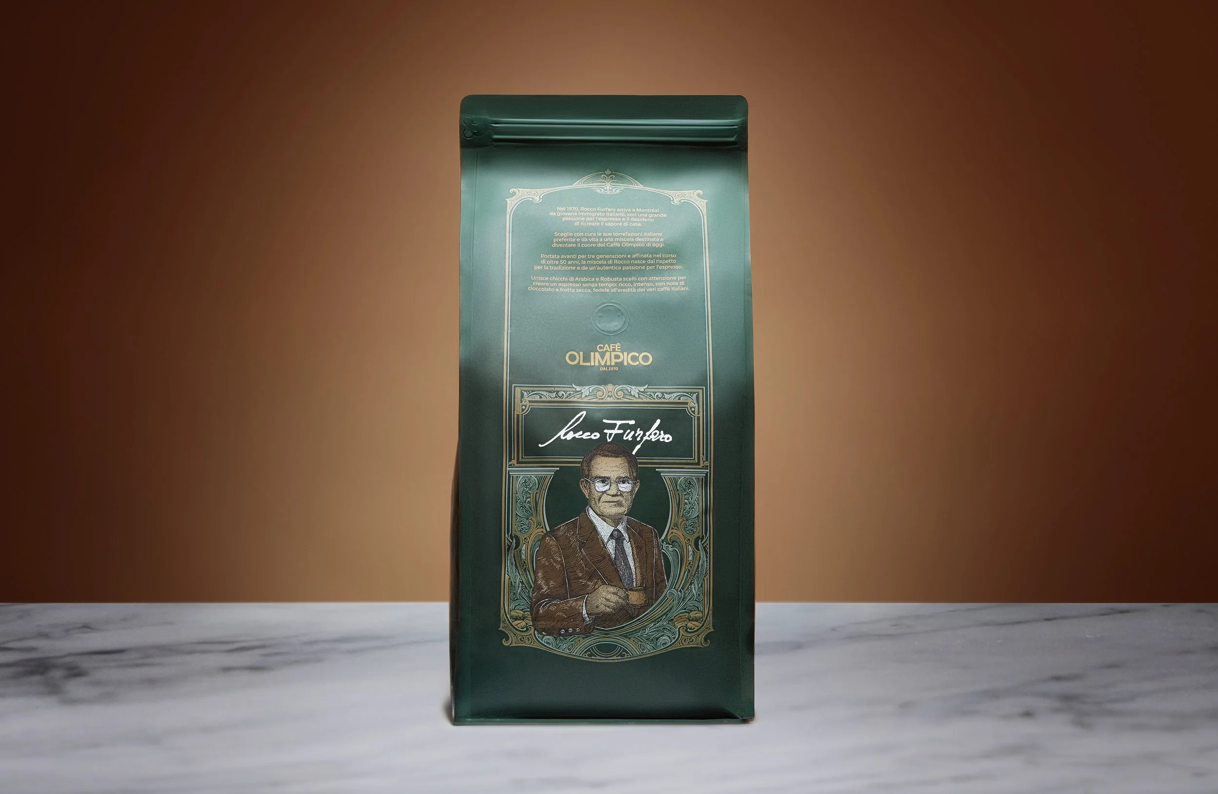
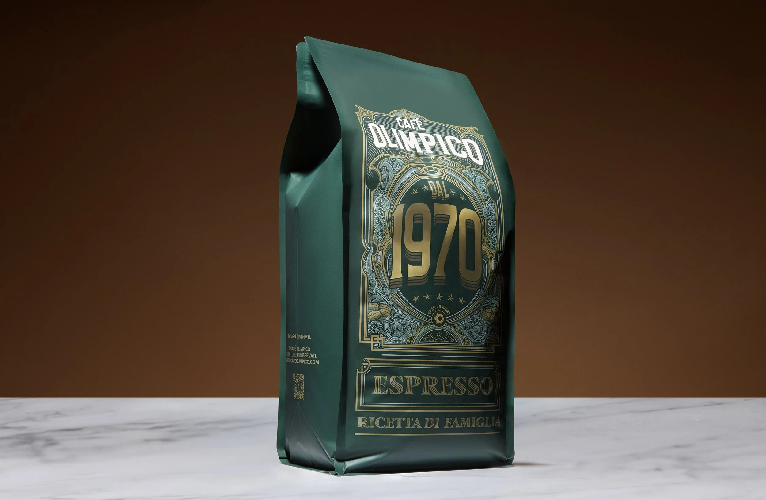
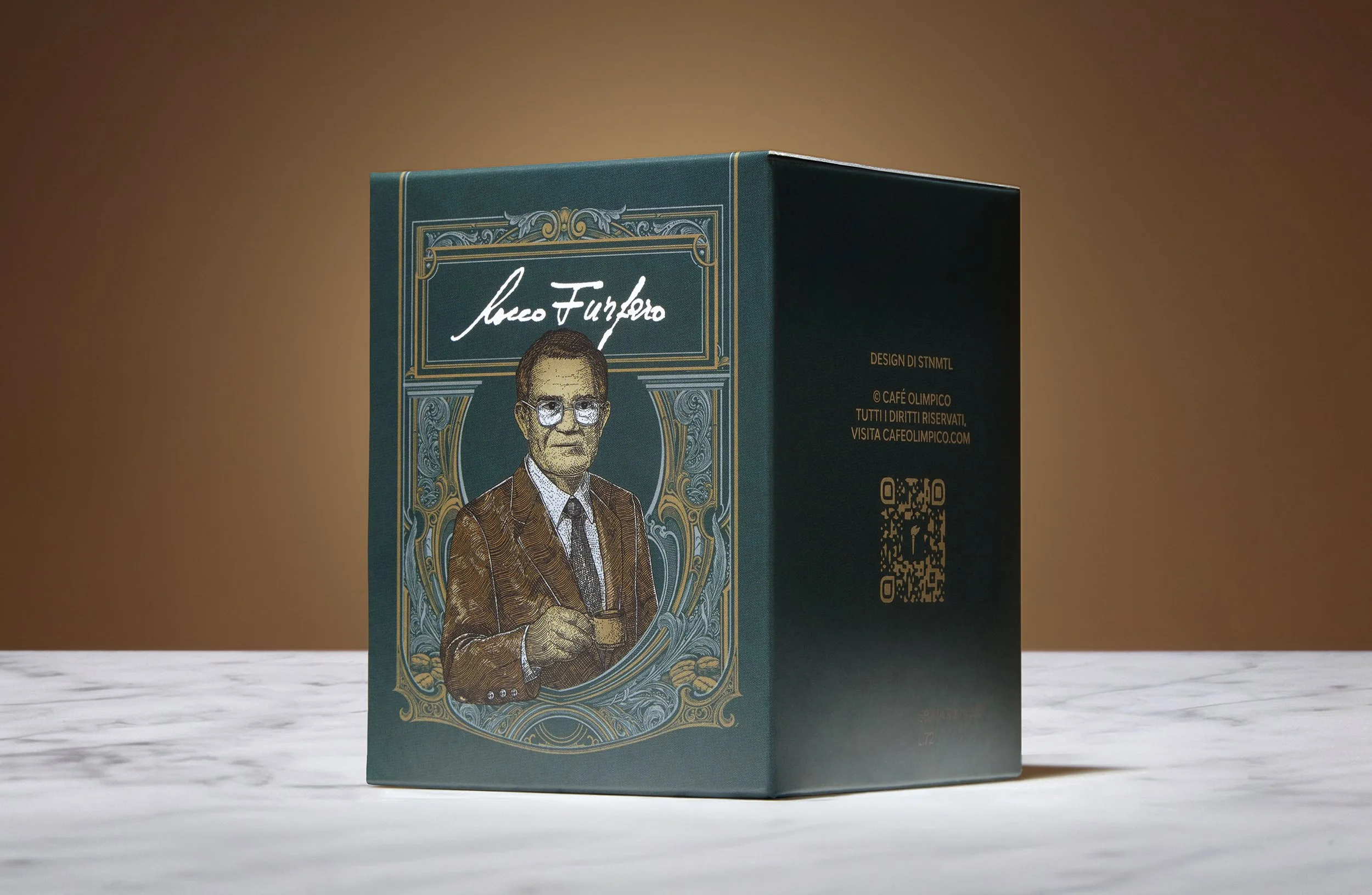
Most heritage packaging reaches for sepia and script, and ends up looking like a business that has stopped. Olimpico hasn’t. It’s a room full of people at eleven thirty at night. So we drew tradition at the volume of its decade. A monumental condensed 1970 dominates every pack, framed in acanthus scrollwork, seven stars and coffee cherries, all hand drawn from the café’s own pressed-tin ceiling, carved wood and etched glass. Below it sits a small roundel: a football and OPEN DA NIGHT. On the back, Rocco’s story in Italian, under his engraved portrait and signature.
The bag is foil stamped, the 1970 catching light along the curve of the pouch. The box is printed flat at a smaller scale, the ornament redrawn so the finest hatching still holds. Two budgets. One family. And a capsule carton built to be emptied in a month, dressed like something you keep beside the machine.
Available at all four Café Olimpico locations across Montréal.
Aabid Youssef Photography ~ Febryan Nur Art & Design ~ Jonathan Vannelli Idea ~ Ibraheem Youssef Maestro